Online shopping has become a global phenomenon, providing shoppers with the convenience of purchasing products from anywhere in the world. However, there is another side to this digital retail industry, as some websites and platforms use deceptive techniques known as dark patterns to manipulate users into taking actions or making decisions that are not in their best interests.
Author of Dark Patterns, Harry Brignull, describes a dark pattern as:
“A user interface carefully crafted to trick users into doing things they might not otherwise do.”
Some examples of dark patterns include “bait and switch,” where a product or service is often displayed at a low price but replaced with a more expensive one at checkout.
“Disguised ads” slip in promotional content with regular content. Users tend to find it difficult to distinguish between the two.
“Forced continuity” involves automatically enrolling users into subscription services after a free trial without any notification, knowledge, or consent, often leading to unexpected charges.
“Hidden costs” is another dark pattern where websites or apps sneakily add additional charges during the purchasing process making it hard for users to know the actual price upfront.
“Misleading Visuals” directs user attention to influence decision-making, such as using prominent buttons or misleading graphics.
Additionally, “nudging” techniques use subtle cues to influence user behaviour, such as strategically placing a prominent “buy now” button.
From a business perspective, websites that include dark patterns in design mainly aim at the quickest conversions for products.
And that leads us to think..
What Do Dark Patterns Invoke in the Human Subconsciousness that Influences their Decisions?
Some dark patterns rely on the fact that the user is in a rush to make the purchase therefore it is easier to sway their decision. They rely on the fact that the user isn’t paying attention to detail.
Here’s an example:

In this example, there’s a big green button that automatically adds insurance, and the arrow shape next to it suggests that clicking it is how you proceed. If you’re not paying close attention, you might miss that it’s tricking you into adding insurance without your explicit consent.
Then there are some websites that use psychology techniques to influence the buyer’s decision. This is where the human subconscious comes into play.
This brings us to emotional resonance.
What is Emotional Resonance? How Does it Impact a User’s Decision?
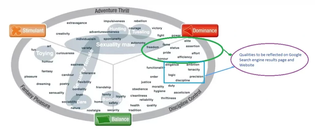
Emotional resonance is the ability of a website to trigger an emotional response in the visitor. Emotional resonance can be used to make dark patterns more effective. For example, an ecommerce website may employ high-end and luxurious imagery, which can lead users to overlook dark patterns and be more inclined to make a purchase.
This happens when the visuals appeal to the limbic system of the brain. The limbic system is a part of the brain that is responsible for emotions, motivation, and memory. It is also involved in decision-making. Dark patterns are designed to exploit the limbic system by triggering emotional responses that can lead to users making decisions that are not in their best interests.

Some examples of how emotional resonance can be used to create dark patterns include scarcity, fear, gratitude, trust, etc.
Websites often employ emotional resonance techniques to tap into various subconscious factors that influence people’s decisions. Here’s how they do so..
Fear of Missing Out (FOMO): They create anxiety by suggesting limited-time offers, making users worried they’ll miss out on a good deal.
Urgency: By pressuring users to act quickly, dark patterns push them to make impulsive decisions.
Scarcity: They exploit the perception of limited availability, making users believe certain products are exclusive, prompting them to take action.
Trust: Dark patterns deceive users by presenting websites as trustworthy or
luxury- oriented, tapping into our inclination to believe in their reliability.
Colours also play an important role in dark patterns.
Dark patterns often use colours to draw attention away from important information or options, making it difficult for users to notice alternative choices. Vibrant or flashy colours may distract users from understanding the consequences of their decision. Colours are used to establish a visual hierarchy, making certain options or buttons appear more prominent and appealing, while downplaying less favourable choices. Colours are also used to create a sense of luxury that entices the users in favour of making the purchase.
Legal Steps Against Dark Pattern
In recent months, these design tactics have faced increased scrutiny, with tech companies facing lawsuits, and several laws have been enforced for protecting consumers from their deceptive practices.
In March 2021, California made amendments to the California Consumer Privacy Act, taking a stand against dark patterns that impeded consumers from exercising their privacy rights.
Similarly, the UK issued guidelines, which later became enforceable under the Data Protection Act, 2018. These guidelines aimed to curb companies from using manipulative tactics to entice underage users into opting for low-privacy settings.
The Indian government has also recently taken significant action to protect consumers from deceptive practices in e-commerce. The Ministry of Consumer Affairs, Food and Public Distribution has issued a ban on the use of dark patterns in online shopping platforms. This move is part of a broader effort to safeguard consumers from unfair trade practices, as outlined in the Consumer Protection Act of 2019.
Dark patterns are considered deceptive as they exploit consumers’ lack of knowledge about the digital environment, causing potential harm or financial loss. By implementing this ban, the government aims to ensure that businesses no longer use manipulative tactics to take advantage of unsuspecting consumers, creating a fairer and safer e-commerce landscape in the country.
What Can eCommerce Businesses Do At This Point?
The ecommerce industry is constantly evolving, and dark patterns are likely to continue to be a challenge. However, ecommerce businesses can take the following steps to improve their practices and create a more ethical shopping experience:
Switch to Highlighting Value Proposition:
Instead of relying on manipulative design tactics, businesses should focus on showcasing the genuinity and true value of their products or services. This helps build trust and loyalty amongst your customers.Make the Website Faster and User Friendly:
Invest in a user-friendly website or app design that is easy to use and offers intuitive navigation. This makes it easy for customers to find products, access information, and complete transactions without confusion or frustration. Improving website loading speed is also essential. A slow-loading website often leads to abandonment of purchase. While a fast-loading site improves user experience and increases the chances of conversion.Transparent Pricing and Policies:
To build trust and prevent cart abandonments, ensure transparency regarding product pricing, shipping charges, and return policies. Avoid surprising customers with hidden fees during the checkout process. Being upfront and clear about all costs helps increase conversion rates and reduces cart abandonments.Offer Better Deals:
Rather than using dark UX patterns, businesses can influence their customers through genuine cost savings and attractive offers. Offering real discounts and promotions will only encourage users to make purchases rather than abandoning the process mid-way. For example, an ecommerce business could offer a discount on a product or service, or they could offer free shipping, etc.Better Targeting Through Campaigns:
Implement better marketing strategies to target the right audience effectively. By identifying and understanding the preferences of potential customers, businesses can tailor their campaigns to reach users who are genuinely interested in their products or services.Genuine Social proof:
Showing genuine social proof, like honest product reviews and testimonials, is essential for building trust among potential customers. Using fake reviews or exaggerated feedback damages the credibility of the brand. When visitors see authentic feedback from other satisfied buyers, they are more likely to make a purchase, as they trust the reliability of those reviews compared to fake ones.Exceptional customer service:
Responding promptly to customer enquiries and concerns creates a sense of loyalty and trust towards the brand. A positive customer experience transforms customers into genuine brand advocates. Therefore, invest in exceptional customer service.Customer Privacy:
Clearly communicate your data privacy practices and obtain explicit consent for data collection and marketing communications. Safeguard customer data and ensure compliance with relevant data protection regulations.By adopting these ethical approaches, ecommerce businesses can build trust with their customers and create a more positive and sustainable shopping environment, benefiting both the business and its users.


