Any Ecommerce entrepreneur wants an efficient and attractive website that will draw in customers and help them sell more and earn revenues. Of course, it is not as easy as it looks. Designing an ecommerce website has to be done with a lot of thought. There are thousands of websites online, and you have to make sure that your site stands out from the crowd. Furthermore, trends keep changing every year with regard to the technology used, as well as the appearance or aesthetics. What would have been a great website say 5 years ago may not be so hot today. So, let’s take a look at the Ecommerce website Design checklist for 2023.
At the very beginning, before you think about your website it is imperative that you understand your target audience – who are you catering for? Knowing this will help you make the website user friendly.
Let’s start by thinking about the platform or software you will use to build your ecommerce store. You have options like:
- Magento – for scalable, secure websites that enable omnichannel sales
- Shopify – for simple websites
- BigCommerce – for reliable omnichannel business
You can outsource your ecommerce site development to a reliable company like Codilar, with years of experience in delivering superlative solutions to a wide variety of businesses. Our team will discuss with you to understand your business goals, requirements, limitations, and more to recommend the ideal ideal e-commerce platform.
We now come to what you need to consider with regard to the design, or in other words, how to design ecommerce website to for your business.
Let’s start with homepage design and a few general guidelines:
1. Is the website compatible and responsive?
There are a large number of devices out there, of all sizes and screen resolutions; it is important that your website performs well on all of those. With most consumers browsing on the go, it is imperative that your site is mobile-friendly, and not only runs flawlessly, but is also readable and easy to navigate. You could consider designing your website as a progressive web app. PWA or progressive web app, is a website that looks and functions like a mobile app without eating up space on user devices. It is also superfast and can be accessed be users even in the absence of an internet connection.
2. Is your shopping cart visible on every page?
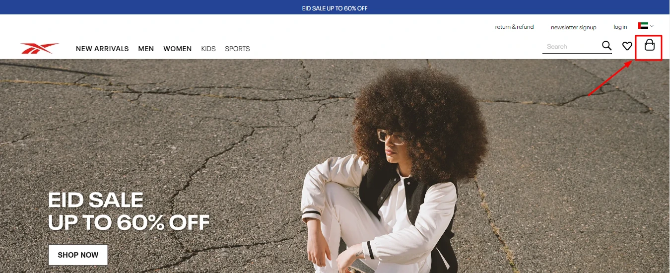
This is critical for an Ecommerce store. It is the place you want to sell your products, and you should remind visitors about purchasing, and make it easy for them to access their cart regardless of where they are. It must be prominently visible, so give it a different color, and ensure that it displays the number of items the customer has added to the cart.
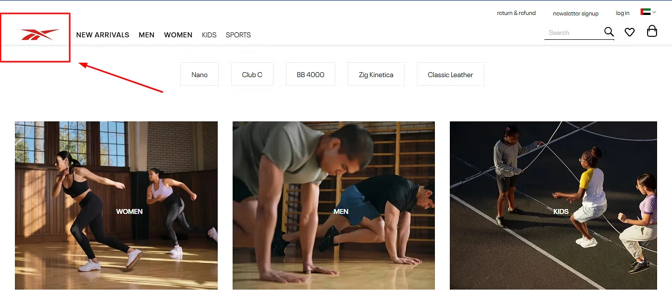
3. Is the brand logo in a predominant position on the page?
Your brand name must be burned into the memory of anyone who visits your site; ergo, your logo and brand name in your distinct colors must be clearly visible and catch the user’s attention immediately.
4. Have you mentioned your USP?
Delivered in 30 minutes or your pizza is free – we are all familiar with the Domino’s promise, and THAT is their USP. Similarly, you have to determine what it is that sets you apart from your competitors, and display that prominently on your home page.
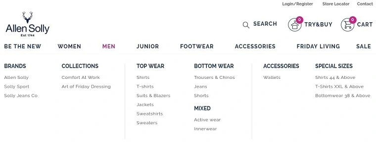
5. Is the menu displayed?
The home page must include a menu which lists the categories of products, from which the sub-categories can be seen. This makes it easy for customers to navigate to the type of products they want to browse.
6. Can the customer search from any page?
This is critical; because, the easier you make it for your customer to search for your products, the higher your chances of making a sale. Don’t make it hard for your visitors to become your customers by forcing them to go to a specific page to search for the product they want! If possible, you can also provide suggestions as the user types.
7. Is it easy for visitors to go from one page to the other?
Being able to navigate easily is a critical feature of Ecommerce website design; one that can make the difference between a purchase and site abandonment. If the navigation is not properly structured, visitors can get confused and irritated, and try another site instead.
8. Can the customer contact you from any page?
Customers, both potential and current, may have several queries regarding a product, your returns policy, shipping, or anything else. Make it easy for them to be able to get in touch with you, from wherever they are on your site by providing a Contact Us button on every page which takes them to a simple form, or just by displaying your contact information. Adding an AI chatbot is a good idea as customers can get replies to generic queries 24/7.
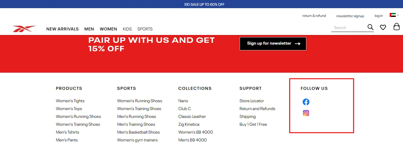
9. Do you have social media icons on all pages?
In an increasingly connected and social world, it is imperative that you provide links to your social media handles or pages. People often prefer purchasing from there, as they can see reviews from other customers, can compare products easier, and even get updates quickly. social media marketing is crucial, and you cannot ignore it.
10. Does the site load quickly?
Quick site loading should be one of the most important items on your Ecommerce website Design checklist. We live in a world with low patience, and nobody likes to wait for over a few seconds for a site to load. People may take time browsing and comparing products, but they want all pages to load super-fast. You may have the best products and lowest prices, but it all means naught if your site takes too long to load. There are a number of ways to achieve fast loading speeds including image compression, using a superior hosting service, and efficient content delivery networks.
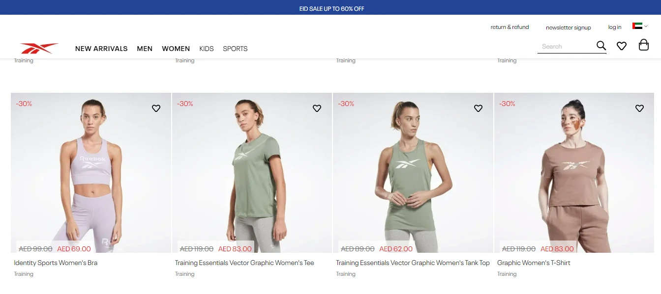
11. Are the images on the site of a high quality?
If you use images on the home page, make sure they are eye-catching, and not dull – it can drive away your visitors. Images on the home page could be photos to represent product categories, product bundles, and so on. All those must be professionally shot, and well laid out so that it doesn’t look cluttered.
12. Have you displayed security badges?
Security badges help increase customer trust and reassure them regarding safety of their sensitive information. SSL certificates are given to businesses after verifying that the company is genuine, and conveys that you are a legitimate business. Customers will be at ease when it comes to making payments knowing that their data is safe.
13. Is the call-to-action properly displayed?
This is a must-have item on anyone’s Ecommerce checklist. A CTA should not only be prominently displayed, but should contain compelling messaging that motivates the customer to take the action you desire. They should grab the user’s attention immediately, so place it with that in mind.
Let us look at the Product Page
1. Are the product images of a high quality and is the product description adequate?
Unlike as in physical stores, your customers cannot touch and feel the products or ask a salesperson details. That is why it is absolutely imperative that you use professional photographs for all your products which show them in the best light; display them from various angles, and allow customers to zoom in. Use models to showcase apparel, footwear, eyewear, jewelry or other accessories so that people can see how it looks when worn. Provide detailed descriptions about each product like material, size, dimensions, expiry date where applicable, origin, and any other important information. You can also try to 3 D-visualization to give your customers an almost physical or real interaction with the product. It is also important to decide the manner in which you will display your product images – grid, scrolling, and list are the most common types.
2. Are you showcasing the top selling products and recommending products?
Human beings by nature are competitive, and want to fit in; when they see the products that are ‘in’ or trending right now, they will also want to purchase them. They don’t want to be left behind! Recommending products is a good way to cross-sell and upsell products; for example, we can see on Amazon, if you add a mobile phone to your cart, you are likely to get recommendations on suitable mobile cases, headphones, screen protection plans, and so on.
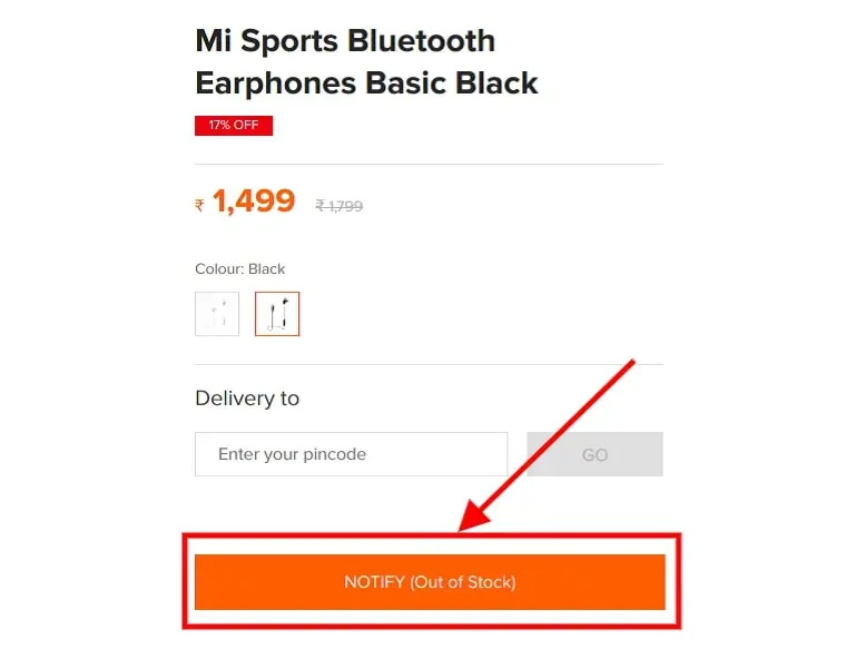
3. Are you showing stock availability on the product page?
This is a critical element of your Ecommerce website Design checklist. Let your customers know how many products you have left, as that will help them take a purchase decision quickly.
Adding product videos help customers see the product from different angles when it comes to apparel, and when it comes to appliances, they are extremely helpful as they educate customers about their functioning – like a demo. When people see how a product works, they will be more inclined to buy.

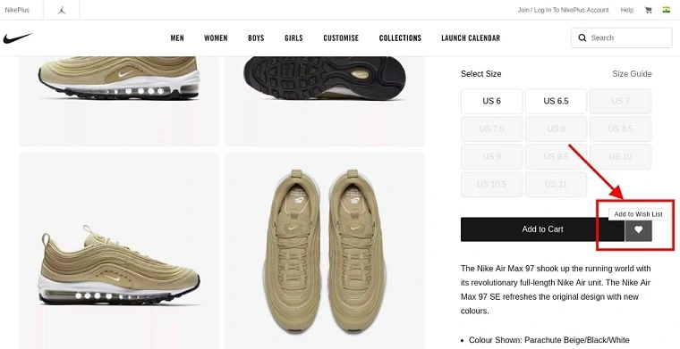
5. Can your customers save items to be bought later?
This can easily be done, and is a very helpful feature. Sometimes customers may like an item but may not have the money to purchase right away. By allowing them to save items to a wish list, you can help them to purchase at a later date. It saves customers the trouble of having to search for that item all over again.
6. Have you provided filtering and sorting options?
Filters allow customers to get shortlisted and qualified results so that they don’t have to wade through hundreds of products that they don’t need or are not in their budget. For example, if a customer wants to book accommodation for a holiday, they should be able to filter by type – resort. Homestay, bed and breakfast, hotel etc., and by amenities, like swimming pool, free breakfast and so on.
7. Are customer reviews included?
This is important because customer reviews are independent and unbiased opinions of customers who have used your products and services, and are more effective in recommending your brand than any other thing you say about yourself.
Shopping Cart & Checkout Design
1. Is your Checkout process user friendly?
You’re almost there – if the customer has come this far, it means they are serious about purchasing. Now make it simple for them to check out their products. Keep it to the bare minimum of steps and don’t force them to fill in lengthy forms. Allow guest checkout, and give them the option of saving their details for the next order. With complicated checkout processes, you run the risk of them abandoning their carts.
2. Show Additional fees now.
If you charge any additional fees, like for shipping, handling, or taxes, this is where you should do it. This ensures transparency, and helps build trust.
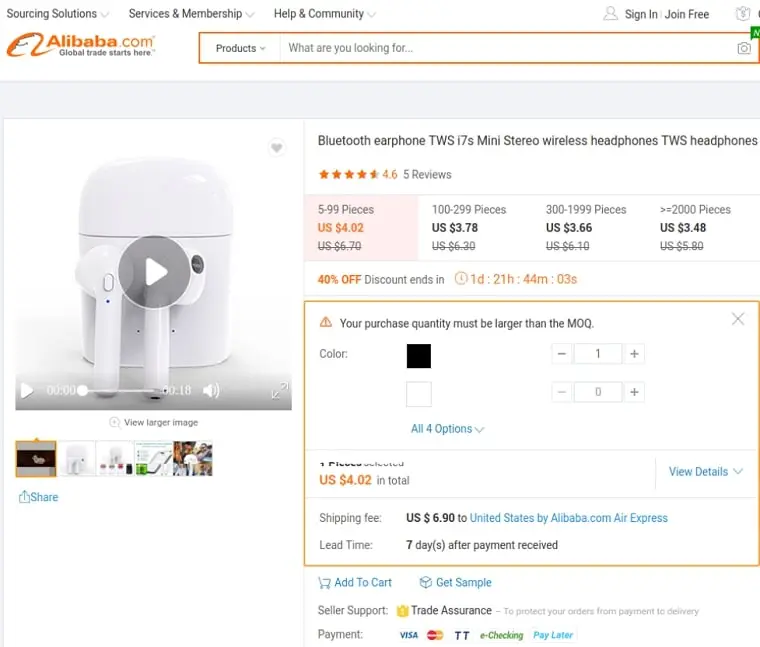
3. Do you have multiple payment options?
Every customer is likely to have a different preferred payment method. Try and cater to as many preferences as possible and offer various methods like credit and debit cards, cash on delivery, digital wallets, bank transfers, and so on.
4. Motivate your customers to complete the purchase
Display messages like ‘Great Choice’, or ‘We’re excited you Chose this product’, etc., or offer them a discount on their next purchase which will be credited in their store wallet once this purchase is completed – or something similar. These tactics go a long way in encouraging customers to complete their purchase
Final thoughts
We have seen now a pretty comprehensive checklist on how to design ecommerce website in 2023. These guidelines will help you optimize your ecommerce site to maximize conversions, which eventually translate into higher revenues. Of course, doing it yourself may not be the feasible solution; you need a tech partner who will incorporate your ideas and turn them into reality.
At Codilar, we don’t just build websites; we craft exciting experiences. Contact us to know more!

