In the ever-evolving landscape of digital design, mastering UX/UI skills is crucial for creating products that not only meet user needs but also delight and engage them. Whether you’re a seasoned designer looking to refine your skills or a newcomer eager to learn, understanding the fundamental principles of UX/UI design guidelines is essential. This blog will delve into essential guidelines to level up your UX/UI skills, focusing on enhancing user experiences, addressing pain points, and refining UX/UI design elements.
Knowing What Users Needs:
At the heart of effective UX/UI design lies a deep understanding of user needs. Conducting user research, user interviews, and usability testing are invaluable methods for gaining insights into user behaviors, preferences, and pain points. By empathizing with users and understanding their goals and motivations, designers can create solutions that address real user needs and deliver meaningful experiences.
Setting Clear Objectives:

Clear objectives are essential UX/UI design guidelines for the design process and ensuring that the end product meets user expectations. Before diving into design work, take the time to define clear goals and objectives for the project. Consider factors such as target audience, business objectives, and desired outcomes. By setting clear objectives from the outset, designers can focus their efforts on creating solutions that align with the project’s goals and deliver tangible results.
Identifying Pain Points through feedback and refining design:
Identifying and addressing pain points is essential for optimizing the user experience and improving user satisfaction. Collect user feedback through usability testing, surveys, and analytics, pinpointing pain points and opportunities for enhancement. Employ this feedback to iteratively refine the design and elevate the overall user experience.
Read our article on 7 Tips on How to Improve the UX/UI Design of a Web Application
Simplifying Navigation:
Streamlining navigation is crucial for ensuring that users can effortlessly find what they’re looking for within a digital product . Clear and intuitive navigation menus, logical grouping of related items, and minimizing the number of clicks required to reach a destination are essential aspects of simplifying navigation. By reducing cognitive load and providing users with a clear path to their desired destination, designers can enhance the overall user experience.

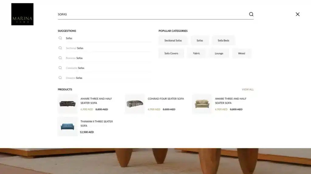
(In Marina Home) To enhance the user experience when searching for products, features such as suggestions, popular categories, and product lists are offered to facilitate seamless navigation, aiding users in easily finding the desired products.
Implementing Responsive Design:
By implementing responsive UX/UI design guide, designers can ensure that their designs adapt seamlessly to different devices and screen sizes, providing users with a consistent experience across platforms. This not only improves usability but also expands the reach of the product to a wider audience.

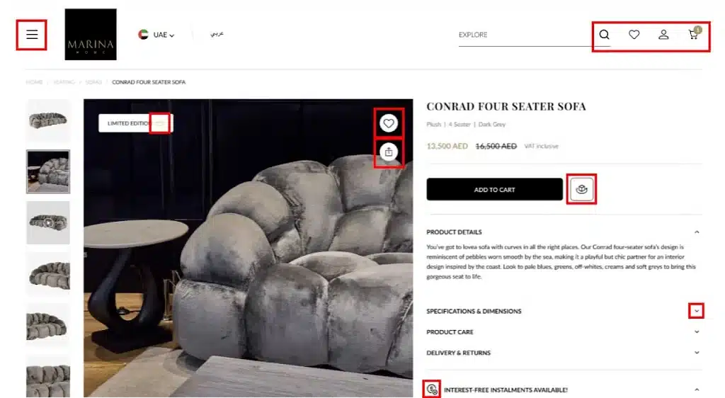
(In Marina Home) The aim is to integrate familiar design patterns across various devices. To align the website with the app design, a hamburger menu is implemented in place of traditional navigation, ensuring consistency across different screen sizes.
Organizing Content with a Clear Hierarchy:
Organizing content with a clear hierarchy is essential for guiding users through a digital experience and helping them prioritize information. By establishing a clear visual hierarchy through the use of headings, subheadings, and visual cues such as color and size, designers can ensure that users can quickly scan and digest content. This not only improves usability but also enhances the overall readability of the interface.

Choosing a Cohesive Color Scheme & Font Family for Consistency:
Consistency is key to creating a cohesive and polished user experience. When selecting a color scheme, font family and icons, it’s essential to choose options that not only reflect the brand’s identity but also provide visual harmony throughout the interface. By maintaining consistency in color and typography across all elements of the design, designers can reinforce brand recognition and create a more user friendly experience.

(In Marina Home) Design consistency is upheld through typography, ensuring uniformity across headings and other content elements by employing consistent styles, colors, and contrasts. Additionally, icon consistency is maintained throughout the screen by exclusively utilizing outlined icons.
Ensuring Readability with Appropriate Contrast:
Readability is paramount in UX/UI design guidelines, as users need to be able to easily consume content without straining their eyes. Proper contrast between text and background colors is essential for ensuring readability, particularly for users with visual impairments or reading disabilities. By using sufficient contrast ratios and avoiding color combinations that are difficult to read, designers can enhance the accessibility and usability of their UX/UI design standards.

(In Marina Home) Enhancing readability goes beyond simply adjusting text size; it involves improving readability by ensuring sufficient contrast between the background and text, thereby reducing eye strain.
Implementing Alignment and Spacing to Improve Readability:
Proper alignment and spacing are essential for improving the readability and visual clarity of a digital interface. Consistent alignment of elements helps create a sense of order and structure, while adequate spacing between elements prevents overcrowding and enhances visual hierarchy. By implementing alignment and spacing guidelines, designers can improve the overall readability and usability of their UX/UI design standards.

(In Marina Home) To improve readability the spacing between elements plays an important role, usually users think the elements which are near tend to group together.
English text is typically read in an F-shaped pattern, moving from left to right and top to bottom. Thus, maintaining left alignment enhances readability When dealing with long body text
To learn more, visit our project, Marina Homes.
Conclusion:
By incorporating these essential UX/UI design guidelines into your process, design elevates well and creates seamless digital experiences that resonate with users. Explore our case studies showcasing how our unique approach empowers our clients’ visitors to personalize their user journey, creating a truly tailored and immersive experience


